


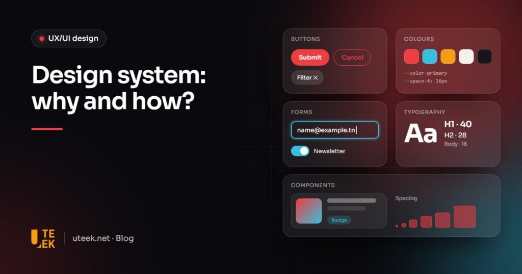
Design system refers to the shared reference behind your interfaces: design tokens (colours, typography, spacing), reusable components, usage guidelines and their counterpart in code. It keeps several screens, products and teams consistent while making design and development faster. You build it in stages: inventory, tokens, key components, documentation, then governance. For a single small website, a lightweight UI kit is often enough.
Key takeaways
- A design system links a design library and a code library sharing the same names and rules.
- It brings consistency, speed, built-in accessibility and easier redesigns.
- It pays off with several products or teams, or an interface that changes often.
- Start small (tokens and key components), then appoint an owner and version it.
What is a design system, in practice?
More than a file of mock-ups, it is a set of connected elements maintained like an internal product:
- Design tokens: named base values (colours, font sizes, spacing, corner radius, shadows, motion).
- Components: buttons, fields, cards, menus, with all their states (hover, focus, error, disabled).
- Patterns: recurring combinations such as a sign-up form or a checkout flow.
- Usage guidelines: when to use each component, and when not to.
- Two synchronised libraries: one in the design tool (Figma, for example), the other in code.
The specification from the W3C Design Tokens Community Group, stable since October 2025, describes tokens as the indivisible pieces of a design system and defines a common format to share them between tools.
Design system, style guide, brand book, UI kit: what is the difference?
These tools complement rather than replace each other.
| Tool | Contents | Main use | Limit |
|---|---|---|---|
| Brand book | Mission, values, tone of voice, personality | Aligning communication | Says nothing about interfaces |
| Style guide | Logo, palette, typefaces, visual rules | Consistency across all media | No components or behaviour |
| UI kit | Components drawn in a design tool | Speeding up mock-ups | No code, few rules |
| Design system | Tokens, design and code components, patterns, documentation, governance | Evolving several products consistently | Needs an owner and ongoing upkeep |
Why set up a design system?
- Consistency: the same button and error message on the website, the app and the customer portal.
- Speed: teams assemble existing components instead of redrawing and recoding everything.
- Built-in accessibility: contrast (at least 4.5:1 for body text under WCAG level AA), focus states and field labels are set once in the component and inherited everywhere.
- Collaboration: designers and developers share one vocabulary.
- Easier redesigns: a new brand colour or a dark mode means updating tokens, not hundreds of screens.
Does your company really need a design system?
It pays off when several products coexist (website, mobile app, back office), when several teams or providers work on them, or when the interface changes every month.
A rarely updated brochure website of a few pages, however, does not need one: a style guide, a lightweight UI kit and a well-configured theme are enough. Maintaining a documented code library only pays off with regular use.
A middle path is to adapt a public system to your brand, such as Google’s Material Design or Carbon, IBM’s open-source system. The DSFR, the French government’s design system, is reserved for .gouv.fr websites: worth studying, not reusing.
How do you build a design system, step by step?
- Take inventory: list the buttons, fields, colours and text sizes in production and spot duplicates.
- Define the tokens: colours, typography, spacing, radius, shadows and motion, named by role (colour-text-error), not by value.
- Design the core components: button, input field, checkbox, toggle, card, notification, with all their states.
- Document: purpose, use cases, do’s and don’ts, accessibility rules.
- Implement in code: a shared library fed by the same tokens as the designs.
- Roll out: migrate existing screens as they evolve rather than all at once.
From design file to code
In Figma, variables store tokens and handle modes such as light and dark (publishing them to a team library depends on your plan). In code, tokens become CSS variables or files for each platform. Components are documented in a tool such as Storybook, which lets you develop, document and test them in isolation, including for accessibility.
How do you keep a design system alive?
Plan three things from the start:
- An owner: a designer and front-end developer pair with dedicated time to decide on requests.
- Versioning: version numbers, a changelog, advance notice of breaking changes.
- A contribution process: teams propose new components, which are reviewed and added if they serve several products.
Common pitfalls
- Building everything before shipping: months of work without real use produce components nobody adopts.
- No owner: everyone creates their own variants and consistency fades.
- Design and code drifting apart: without shared tokens, designs and code diverge further with every release.
- Ignoring accessibility: one flawed component spreads its defect to every screen that uses it.
FAQ
How long does it take to build a design system?
It depends on the number of products and components. A first version limited to tokens and common components can be used early, then grow project by project. A design system is never finished: it evolves with your interfaces.
Can you start from an existing design system such as Material Design?
Yes, it is a good shortcut for a business application or a first product: you adapt the tokens to your brand and reuse proven components. The trade-off: a potentially generic look and a dependency on the system’s roadmap.
Does a design system work with WordPress?
Yes. A WordPress theme’s theme.json file centralises colours, typography and styles, so it can hold your tokens. The theme’s blocks and patterns then act as components.
How do you measure the value of a design system?
Set metrics before you start: time to ship a new screen, number of interface bugs, share of screens built with official components. Compare them after a few months, and ask designers and developers what still slows them down.
Build your design system with Uteek
At Uteek, a digital agency based in Les Berges du Lac 2, Tunis, our UX/UI design team can audit your interface and create a design system sized to your product, from a lightweight UI kit to a library shared with your developers. Explore our graphic and UX/UI design services, browse our achievements or tell us about your project.
Related articles
Web accessibility: a practical guide to making your website usable by everyone
Contrast, keyboard navigation, alt text, forms: web accessibility benefits all your visitors and is now a legal requirement…
Brand identity redesign: 10 steps from audit to launch
Dated logo, inconsistent materials, new positioning? From audit to trademark filing, here are the 10 steps of a…
User testing: how to validate your website or app before launch
Internal opinions cannot validate a user journey. When to test, how many participants, which methods and what to…